EN | Logo
EN | Logo
Corporate Design
The Logo
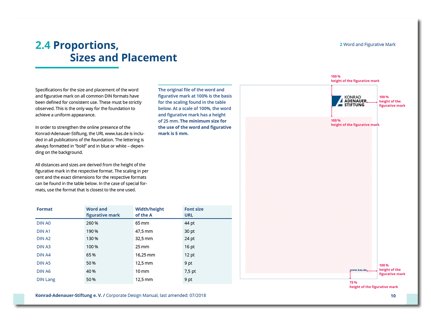
A redesigned, contemporary logo guarantees national and international recognizability as well as associating a crisp, professional look and feel with the brand. Distinctly defined positions, proportions and protection zones allow for enough flexibility in usage, but also allow for a clear framework of action.
Bold and simple – distinguishable and contemporary: the logo fits seamlessly into the newly developed corporate design and visually represents the brand’s core values.
EN | Basics
EN | Basics
The Basics: Colors, Design, Typeface
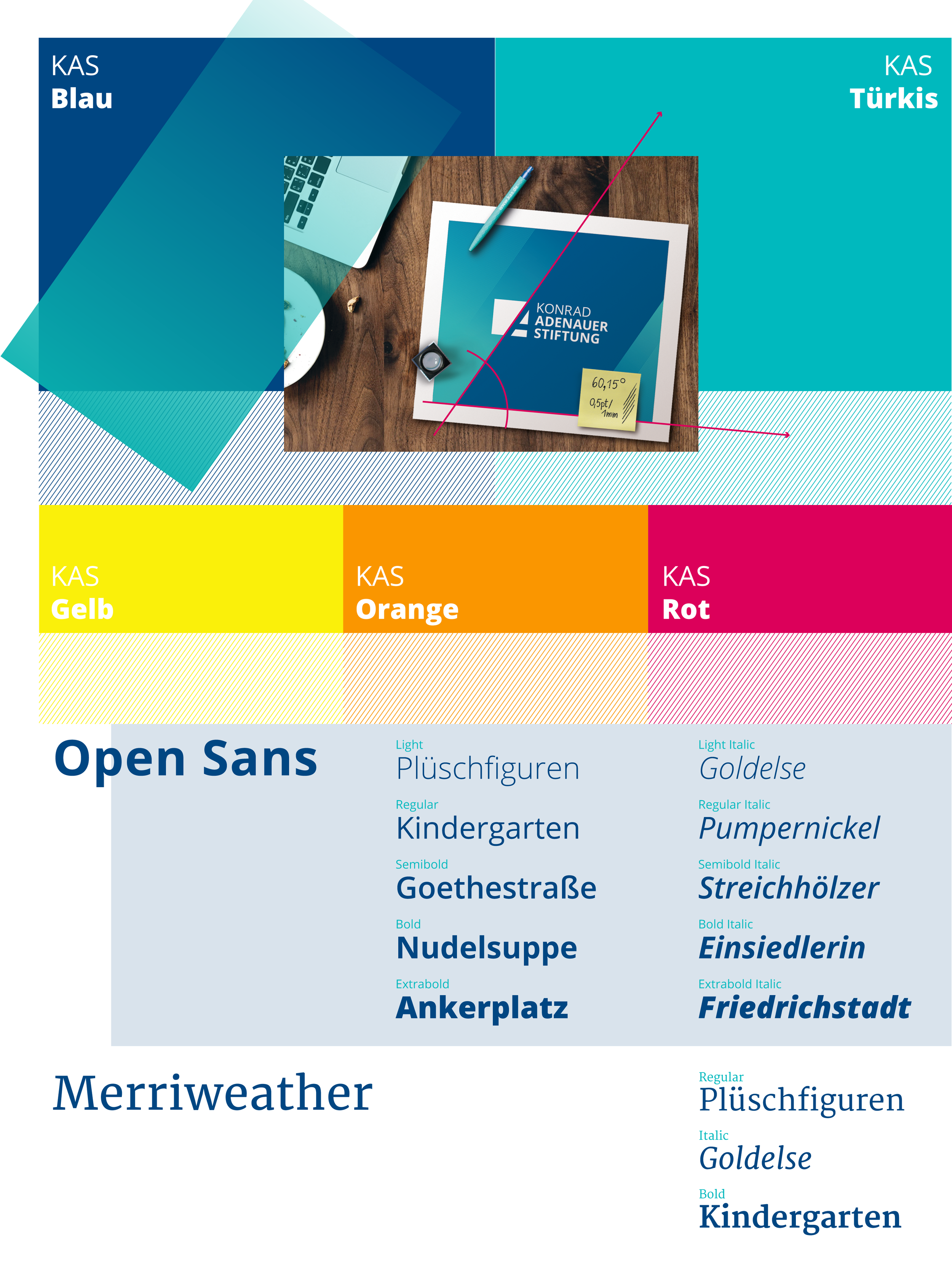
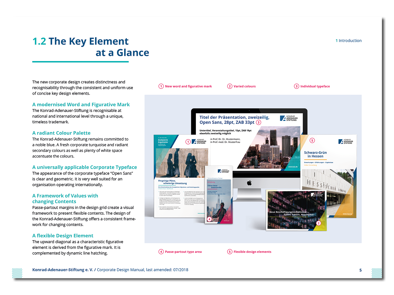
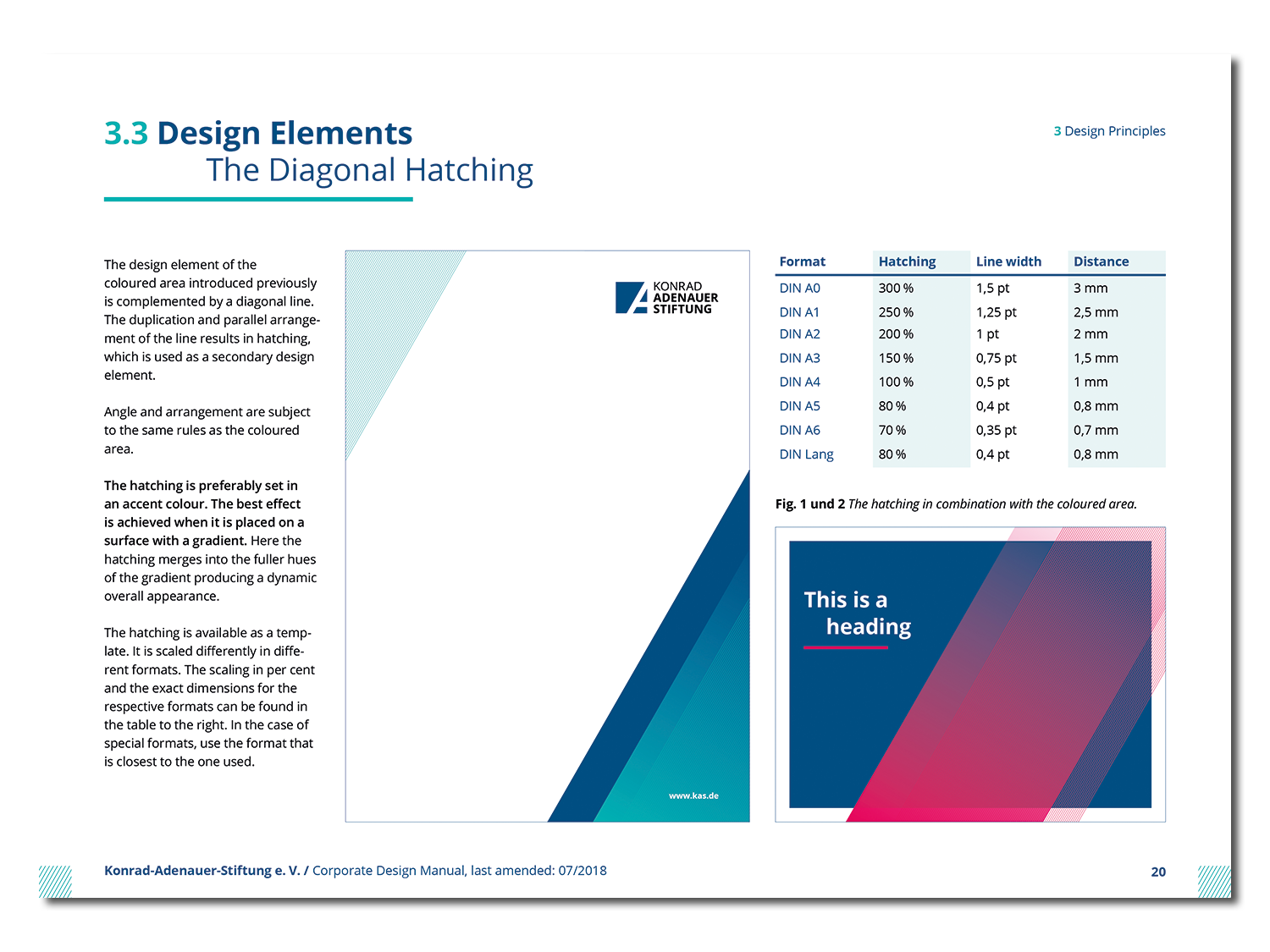
The main design element, a diagonal upward line, clearly references the dynamic of the logo’s figurative mark. It is complemented by a diagonal hatching, transparent gradients and a bright and contemporary color palette. The foundations design thus mirrors the social and political life in Germany – by being dynamic, modern and diverse.
EN | Layout Principle
EN | Layout Principle
The Layout Principle
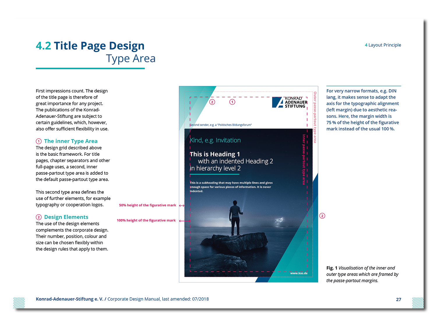
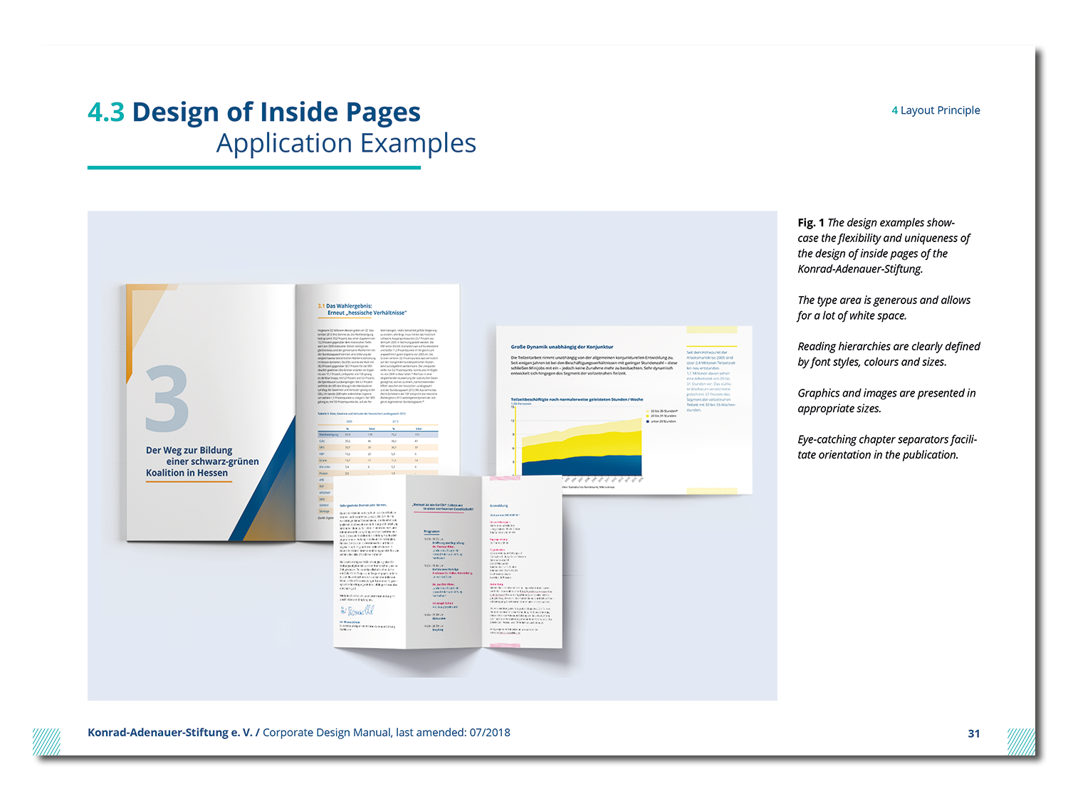
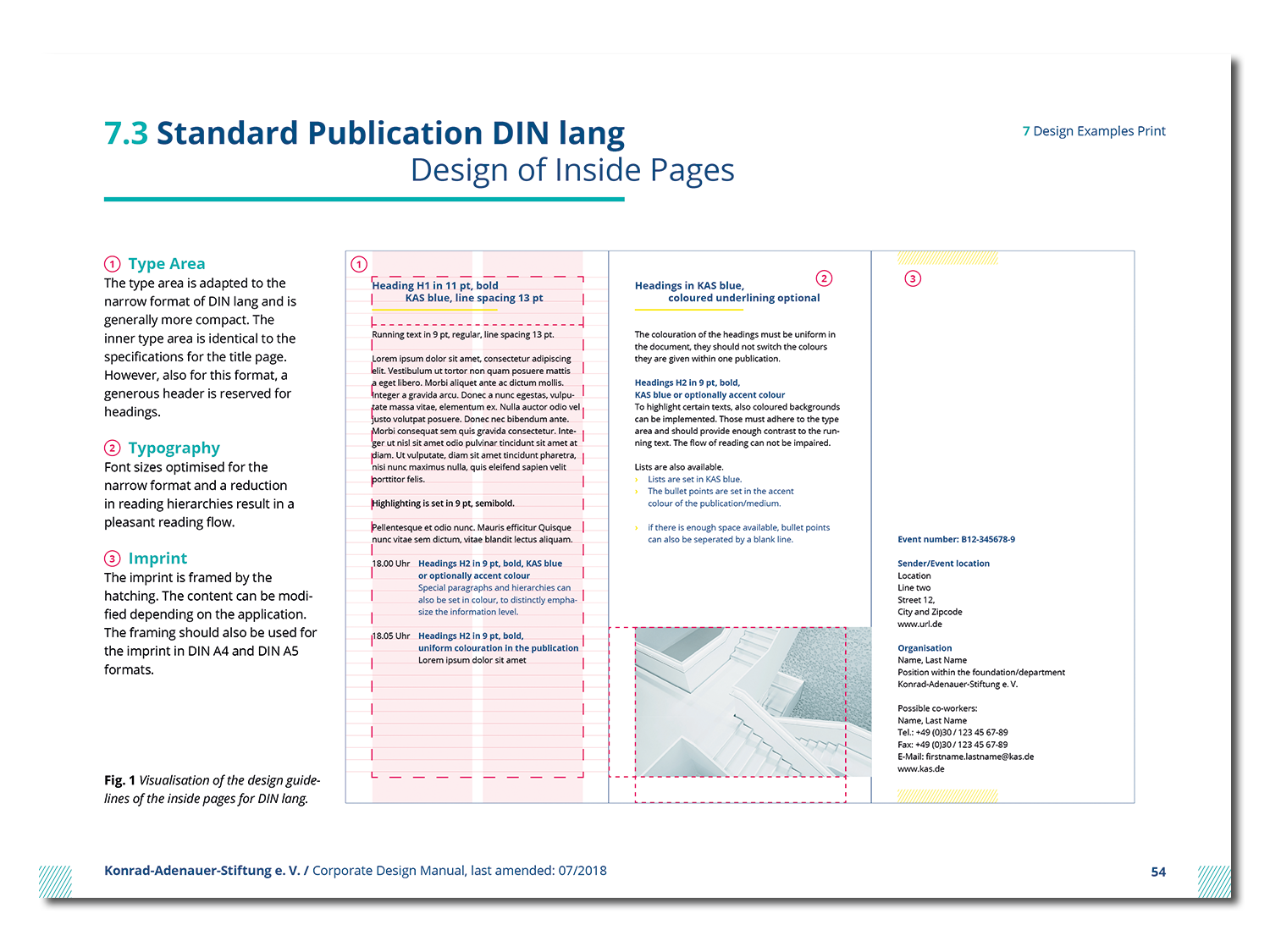
Passe-partout margins create a visual framework for the multitude of contents of the foundation to be presented in. This layout principle, its design grid and various font hierarchies allow for a cohesive look that can be adjusted to best represent the given content. A layering principle underlines the flexibility of the design whilst also representing the multidimensional nature of the client.
Visual layers, overlapping gradients and transparencies represent the foundation’s flexibility – as well as the complex nature of its topics.
EN | Corporate Documents
EN | Corporate Documents
Corporate Documents – Stationery, Powerpoint and more
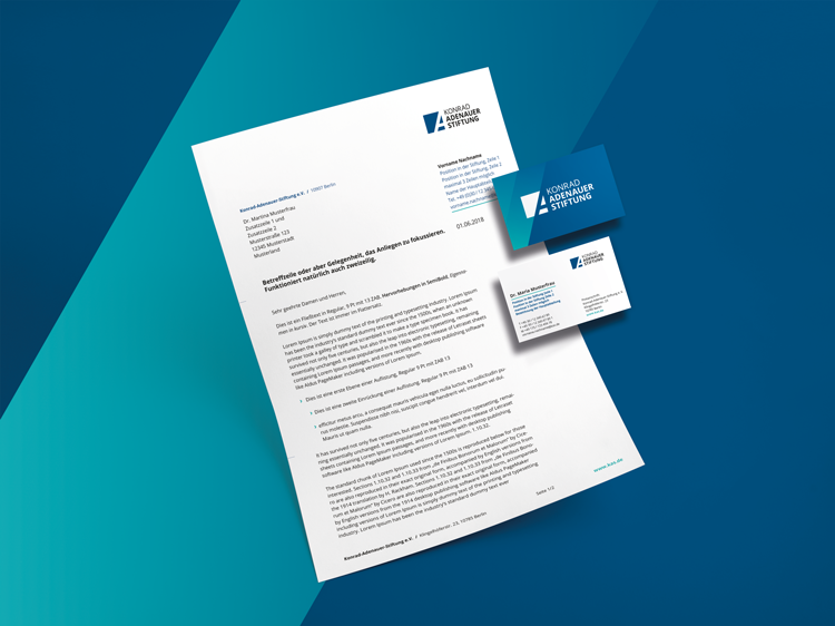
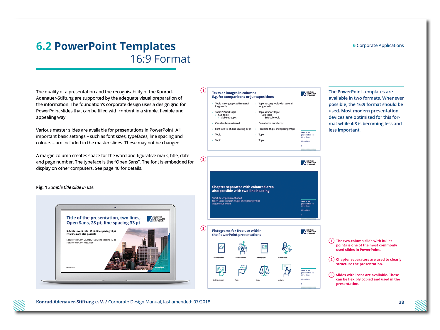
First impressions do count. The foundation’s stationary and other corporate documents are a crucial part in that first impression. Their consistent design guarantees a professional and sincere attitude externally, whilst internally offering flexible possibilities in working with templates for the users.
Easily usable and cleverly designed: office-templates and stationery for presentations and documentations.
EN | Design Manual
EN | Design Manual
The Foundation’s Corporate Design Manual
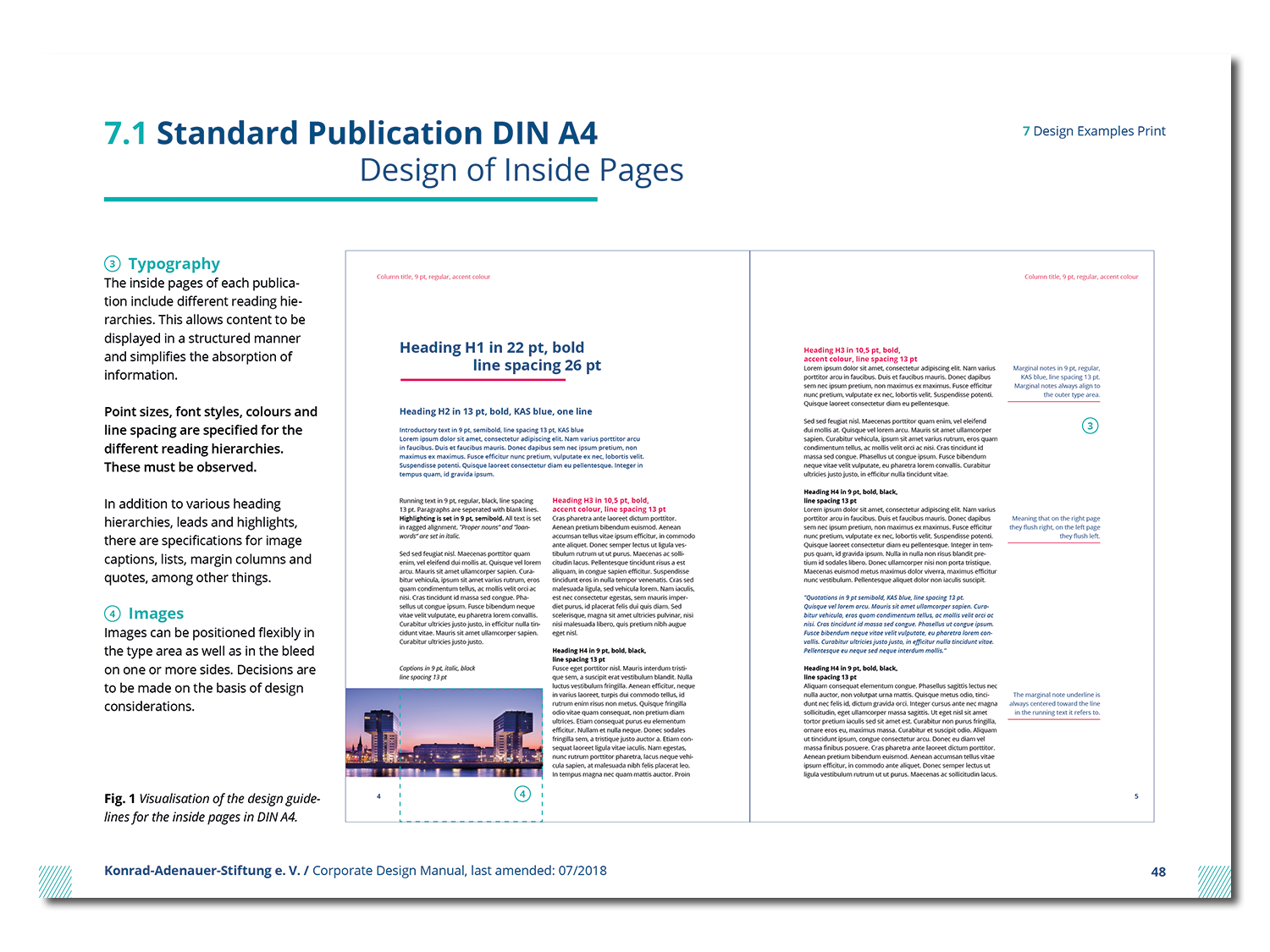
The corporate design manual is the most important guideline when it comes to executing the design principles of the Konrad-Adenauer-Stiftung. Within this document, the basic design elements of the foundation, its most important visual communication components and templates are presented and explained. This way, a cohesive communication can be guaranteed whilst also allowing sufficient freedom in creating special formats, contents or media.

